Marketplace
Case studies
Project Introduction
How I used UX Design to understand our users and the business’s needs, connecting them through a simple, familiar, and fast experience.
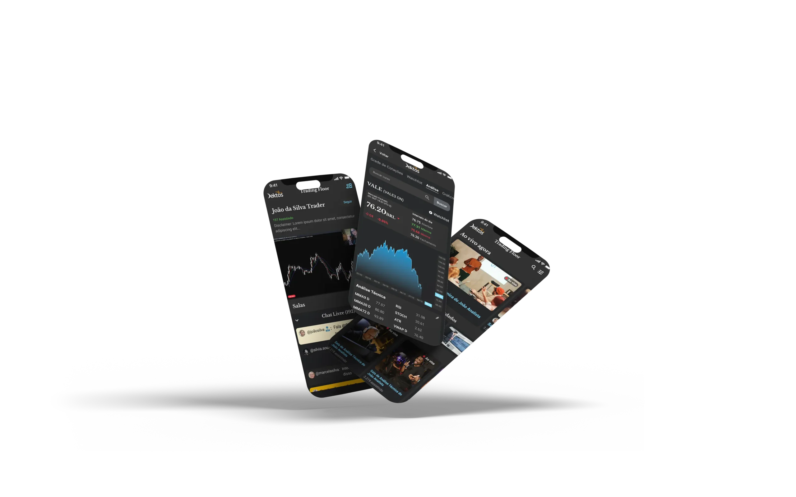
Dektos was a great project I worked on between August and December of 2021. It is a Social media focused on finance, trading, and stock analysis. Most of what was created is still in development, so in this case study, I will focus on the marketplace features.
The Problem
The founder came to me with an idea in mind. Create an app that can engage the users for long hours, that have a chat between users, and where they could sell affiliate products, everything having finance, trading, and the stock market as the main subject. After the briefing, I discovered that to achieve what they wanted, the app needed to be more complex and the best solution for them would center every feature with a social media approach. Integrated marketplace, live trading rooms, stock information, and analysis together with posts and shares at their feed, a news platform that could receive data from the leading news websites, and many more.
The Idea
The social media platform would gather people with interests in common, a place for sharing trading and investment ideas, focused on education, services, and analysis. Basically, Feed, private messages, and the possibility to share, like, and comment on other members’ posts.
It was decided to have a marketplace instead of selling products as affiliates, it would be great to have a place for their users to sell their own products. So instead of making a certain effort to bring 100,000 users to the app, it would be better to make an effort to bring 10 users/influencers with courses, reports, live streams, and analysis, and these people with their influence, bring the audience to the app.
Live trading rooms are a high-ticket product that costs an average of US$160 to US$250 monthly and usually have a high engagement. These live tradings are a trader or analysts sharing their knowledge and strategies with the audience, who replicate some strategies in their own trading account or investment portfolio.
Stock information and analysis about the companies, indexes, currencies, and bonds the users follow, have on their wallet or add to the watchlist, economic calendar with the main events available to the users.
The news platform was one of the most interesting ideas. Since news often brings volatility to the markets, and it’s expensive to pay for a news platform such as Bloomberg Terminal, we had two interns from one of the best universities in Brazil to share the news that can move the markets as soon as it’s available. It’s not scalable, but we had a Telegram channel to validate this idea, once it’s validated, algorithms and journalists from the field would replace the interns. This news platform was my favorite feature because I created a cascade strategy to populate the whole Journal with relevant news with just one or two people.
We had other features such as NOW, a feature that would be similar to the REELs from Instagram and TikTok and an events platform to host seminars, speakers, and corporate events via video and/or audio, with moderators and audiences that could interact in a very simple way.
In the beginning, I was working by myself with a full UX Design Thinking process, and since I was the Product, UI, and UX Designer, Marketing Strategist, and the manager of the four developers that worked with us, I had to use good references and interview very few users to make it happen within their deadline.
It was challenging to work under these conditions, with a very tight schedule and budget. But it was not a problem, indeed, it was the best project I have participated in so far. In a bit more than 4 months, using a simple strategy to designing fast based on reference studies, I interviewed 20 potential users and designed over 200 screens for Mobile and web versions. The link to the prototype can be found here (It’s in Portuguese since the company is Brazilian).
Design Process
With the initial idea in mind, aligned with the CEO. I used a 5-stage design thinking model to validate the ideas, and see if it’s actually what our users needed. The stages are as follows: 1. Empathize, 2. Define, 3. Ideate, 4. Prototype, 5. Test.
Design toolkit
Research
The first thing we focused on was our research strategy. In order to validate the ideas and the goals viability, I entered in three WhatsApp groups, all of them with retail and professional traders and analysts.
*Parts of the interviews will be presented ahead.
This groups helped me to quickly identify three types of potential users, and thus create our personas.
The personas
The personas were inspired by the potential users I interviewed and I used Notion to do it, as in the screenshots underneath.

*Screenshot from Notion
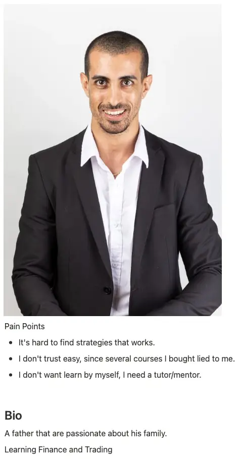
*Screenshot from Notion
With the initial idea in mind, aligned with the CEO. I used a 5-stage design thinking model to validate the ideas, and see if it’s actually what our users needed. The stages are as follows: 1. Empathize, 2. Define, 3. Ideate, 4. Prototype, 5. Test.
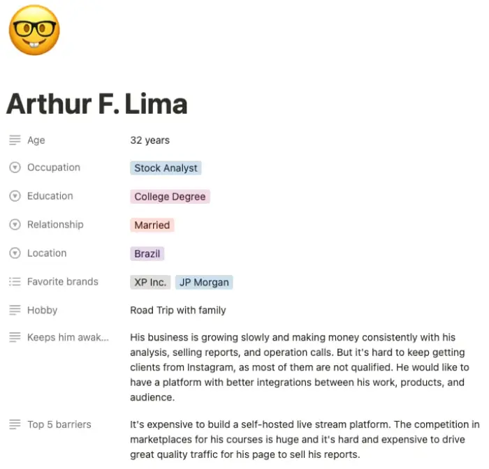
*Screenshot from Notion
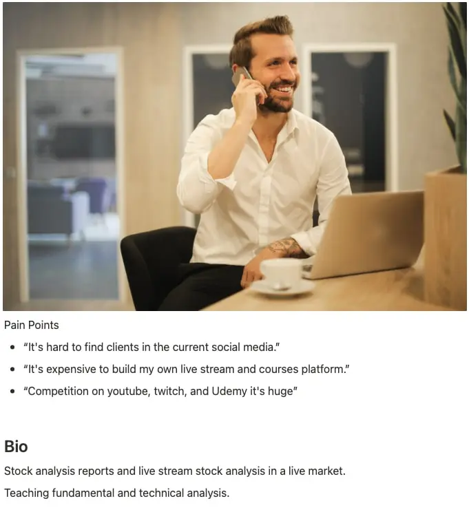
*Screenshot from Notion
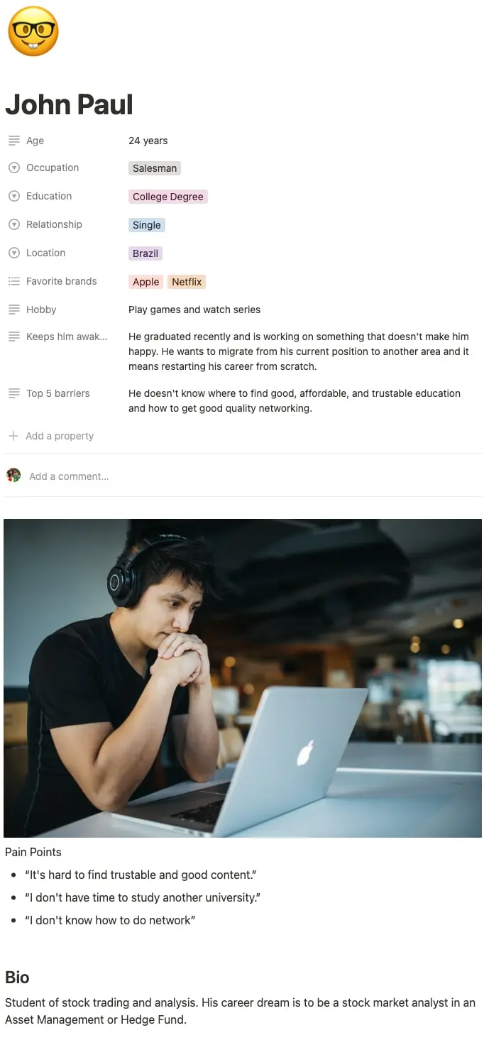
*Screenshot from Notion
Competitor Analysis
As part of our competitor analysis, I analyzed and collected data from two of our main competitors.
In Brazil, it was the TC TradersClub, the leader in the social community finance-based in Brazil, with over 500,000 users and a clear focus on good quality information on what could cause price volatility.
In the USA it was Seeking Alpha, a crowd-sourced content service for financial markets, their articles, and research cover a broad range of stocks, asset classes, exchange-traded funds, and investment strategies.
The analysis of these competitors was with the intention to know the gaps in their services and how they were performing during the launch of their platforms and products.
The material of this research was screenshots and user interviews. We used it to brainstorm ideas and plan what we would launch to be competitive.
User Journey
Now that we know more about our personas, our competitors and the company itself. It’s time to understand the spots where we are going to promote this contact.
For that, I will map the process that one of our personas made to successfully use the app’s marketplace.
The intention is to generate great ideas by empathizing with John Paul, our persona.
- Name: John Paul
- Age: 24 years old
- Occupation: Salesman
- Degree: College diploma
- Income: US$2,500
Persona: John Paul wants to learn more about finance, grow his personal portfolio and find another occupation that makes him proud of himself since he’s currently unhappy with his job.
Scenario: John Paul is trying to find courses and educational content that can bring him enough knowledge to get him a job as a Junior Stock Analyst without spending years in a university. John Paul already bought several courses from bad professionals, people who sell dreams of easy and fast money, day trade, and crypto coin gurus. He is now skeptical about these online “specialists”.
Objectives and expectations: Learn from someone with real results as a professional investor or certified analyst, buy a course and spend a year or so learning from seeing someone more experienced performing operations in front of his eyes.

*Screenshot from Miro
After mapping the user journey, we identified great opportunities for improvement such as:
- Make campaigns with digital influencers to increase our brand awareness and become one of the first options in search engines.
- Give the course owner instructions to give part of the course for free, maybe 1 or 2 modules, so the user tests before purchasing.
- Easy access to free courses, ebooks, and others. Incentives for creators make free courses and masterclasses as well.
- Possibility to contact the users that wrote reviews, it’s great for trust building.
- Discounts, promotions, and the possibility to divide the payment in the credit card, since most finance courses have high tickets.
- Opportunity to find a job by networking or through a job bank and build tools so recruiters find easier and faster candidates available.
We didn’t know how to validate these ideas before marketing them, so we added them to a CSD Matrix (Certainties, Suppositions, and Doubts).
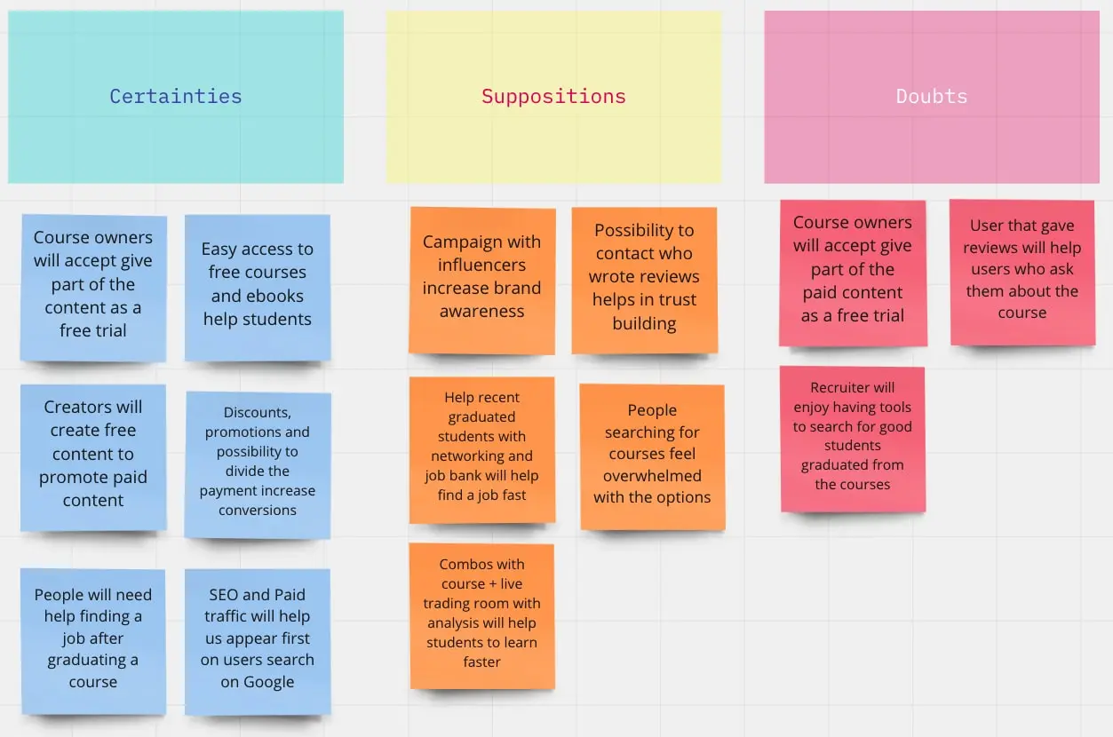
*Screenshot from Miro
Quantitative and Qualitative research
Objectives
The intent of this phase of research was to filter our ideas, eliminating the ones less feasible and prioritizing what could cause more impact on the user’s experience.
At this point in the process, we were overloaded with ideas. The research and organization/prioritization helped us to keep focused on the main goal of the project.
With the CSD Matrix information, we elaborated 3 questions to be asked in a interview with potential users. We asked for a WhatsApp group with 20 users, and asked that the answers would be sent in private.
- Imagine that you finished a course and left a review. How would be your interaction if an unknown person sent you a private message to ask you about your review?
- How would you feel If the last course you took had also helped you by introducing you to recruiters or showed you jobs available for people with the skills you just earned?
- How do you feel when you want to buy a course, and you see yourself in a marketplace browsing the options?
45% said it would depend on the approach. If the person asked politely generally about their experience, they would answer without any problem.
70% agreed if it becomes frequent, they would delete the review.
100% said they would like to ask someone about the content but they wouldn’t like to receive too many requests.
Solution: Based on these answers, we decided to not include this feature for now.
100% said they would like to have the opportunity to be found or to find job opportunities if they were available and searching for a job.
Solution: We decided to design this experience as well. A way the users that made a course set themselves available or not for being found by recruiters. But this feature will be launched only after the business model validation.
80% said they filter by a number of reviews, only buy courses with more than 4 stars and they feel a mix of excitement and hope because they are going to do something new, but also overwhelmed with the number of options. 30% said they would prefer a few great options instead of a large number of options with just a few great ones.
Solution: It was considered only allowing selected instructors in this first moment after the launch, also to guarantee a high-quality level.
With the ideas generated in the journey map, we added it to a prioritization matrix 2×2 and decided that it would be wise to let the tool for recruiters and the job-hunting platform be planned after the business validation.
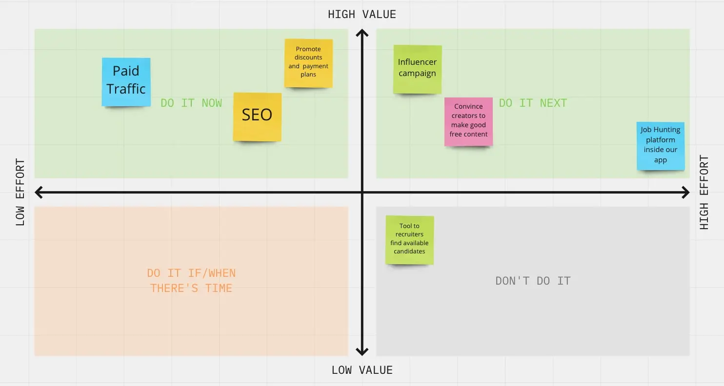
*Screenshot from Miro
What I suggested
With the data collected so far, we planned our marketplace, focused on educational content. The products would be focused on learning more about technical and fundamental analysis, trading, economy, and finance in general.
To fulfill this expectation, reports, live trading rooms, courses from several different areas complement themselves, trading and analysis platforms, signals and calls of operations made by analysts, and live events.
So far, the idea was simpler: Design a social media focused on the financial market and sell affiliate products on it. But since the growth strategy requires turning the Dektos store into a Marketplace, allowing content creators to launch their courses in the platform, not just the marketplace platform, but live stream, chart analysis, live event hosting, and other features would need to be designed.
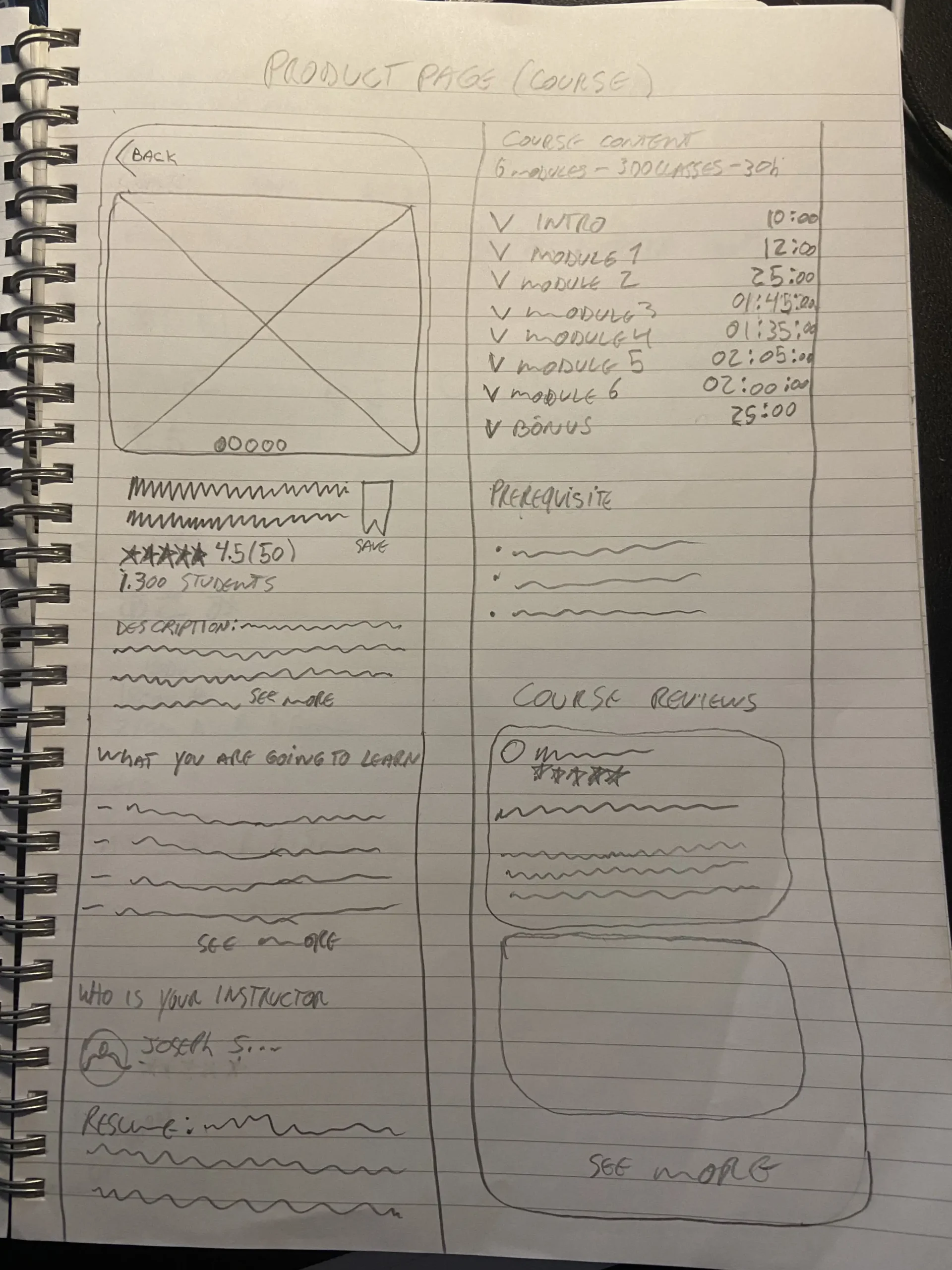
Since the group paused the app development, I can’t show much detail about these features, they are still to be tested with users. But the marketplace started with a simple sketch made with pen and paper, low-fidelity wireframe, and the high-fidelity prototype as demonstrated in the images underneath.
Marketplace Sketches (Feed, product page, see all and cart screens):
First sketches
It’s the fastest way to start thinking about layout ideas based on inspiration and references. After a few options, I came to like this one and moved on to wireframing.
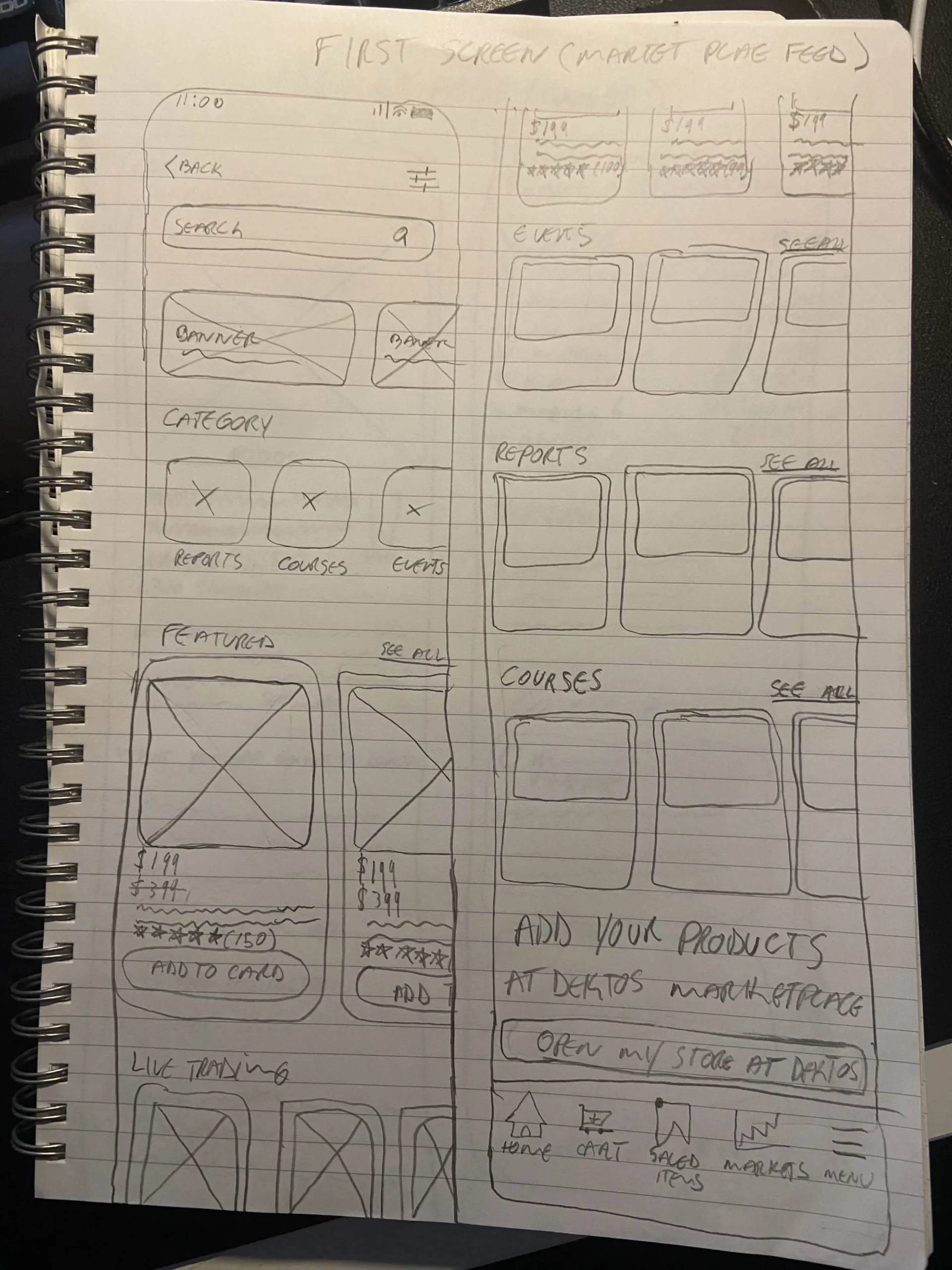
*Photos of the initial sketches
Lo-fi wireframe
The best way to test screen flows and validate the ideas. Colors and a beautiful design might make the user feel biased to like more and approve the design, forgetting the main goal of the test. See where the user might have problems navigating and how we can make his journey shorter and more intuitive.

*Image of the final wireframes

Final design
Now we are testing interactions and transitions and sending the prototype to the development team. Changes were made as requested by the development team, I added the search (Buscar) button to help the user understand they have to search the term and wouldn’t have auto-suggestion. The auto-suggestion would make the app use more servers and thus stay out of the free tear at the Firebase. When the project resumes, the new designer will receive guidelines made by me, one of the topics is to remove this button if the app enters a paid tear at the backend service.

*Image of the final design

The business model Canvas
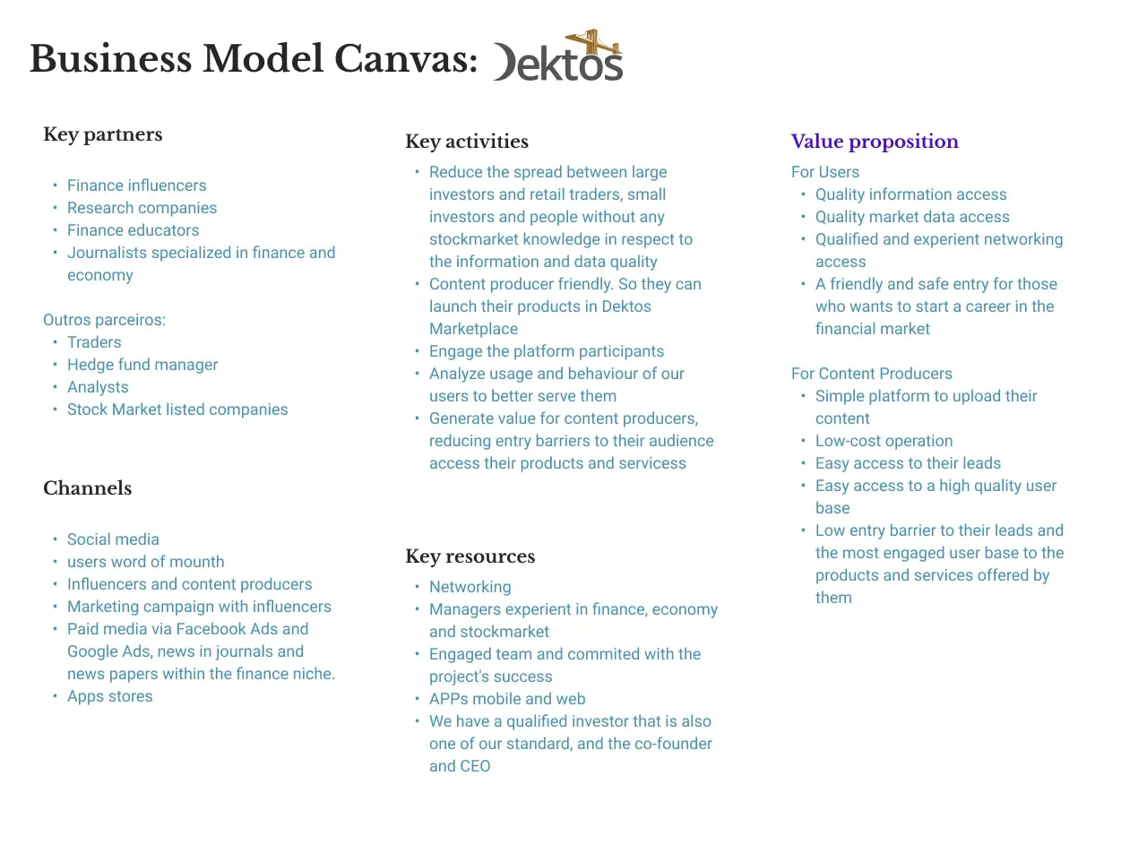
*Screenshot from Figma
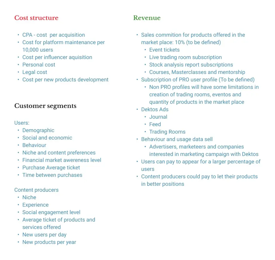
*Screenshot from Figma original file (at the end of this case study)
With clear language, large buttons, great contrast between colors and font sizes as well as the mission of reducing complex tasks to as few steps as possible.
Design system and components
The design system is elegant and was thought to be different. The idea to not have a white background is due to accessibility, the app was designed to be used several hours per day, so a light beige background is better to read and spend time analyzing the market. We also have a dark mode.
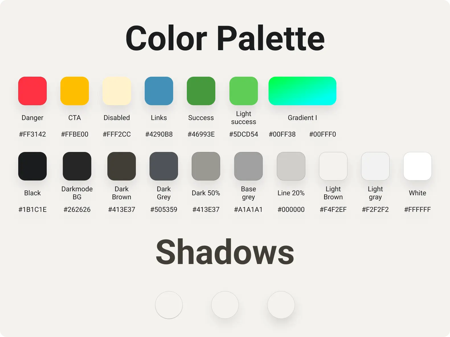
*Screenshot from Figma original file (at the end of this case study)
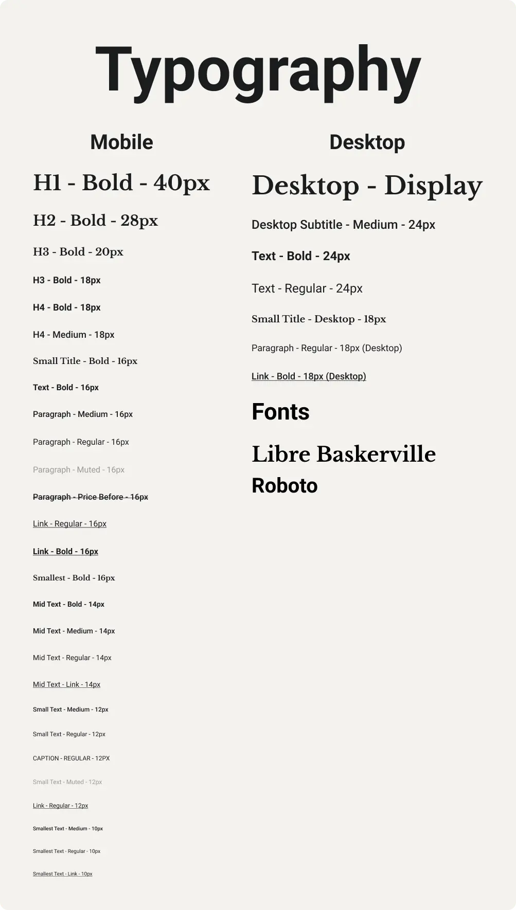
*Screenshot from Figma original file (at the end of this case study)
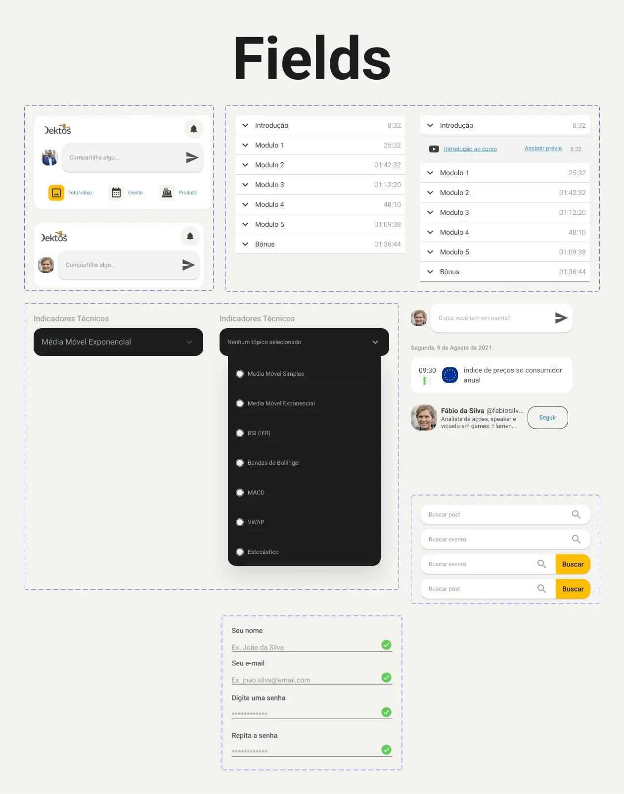
*Screenshot from Figma original file (at the end of this case study)
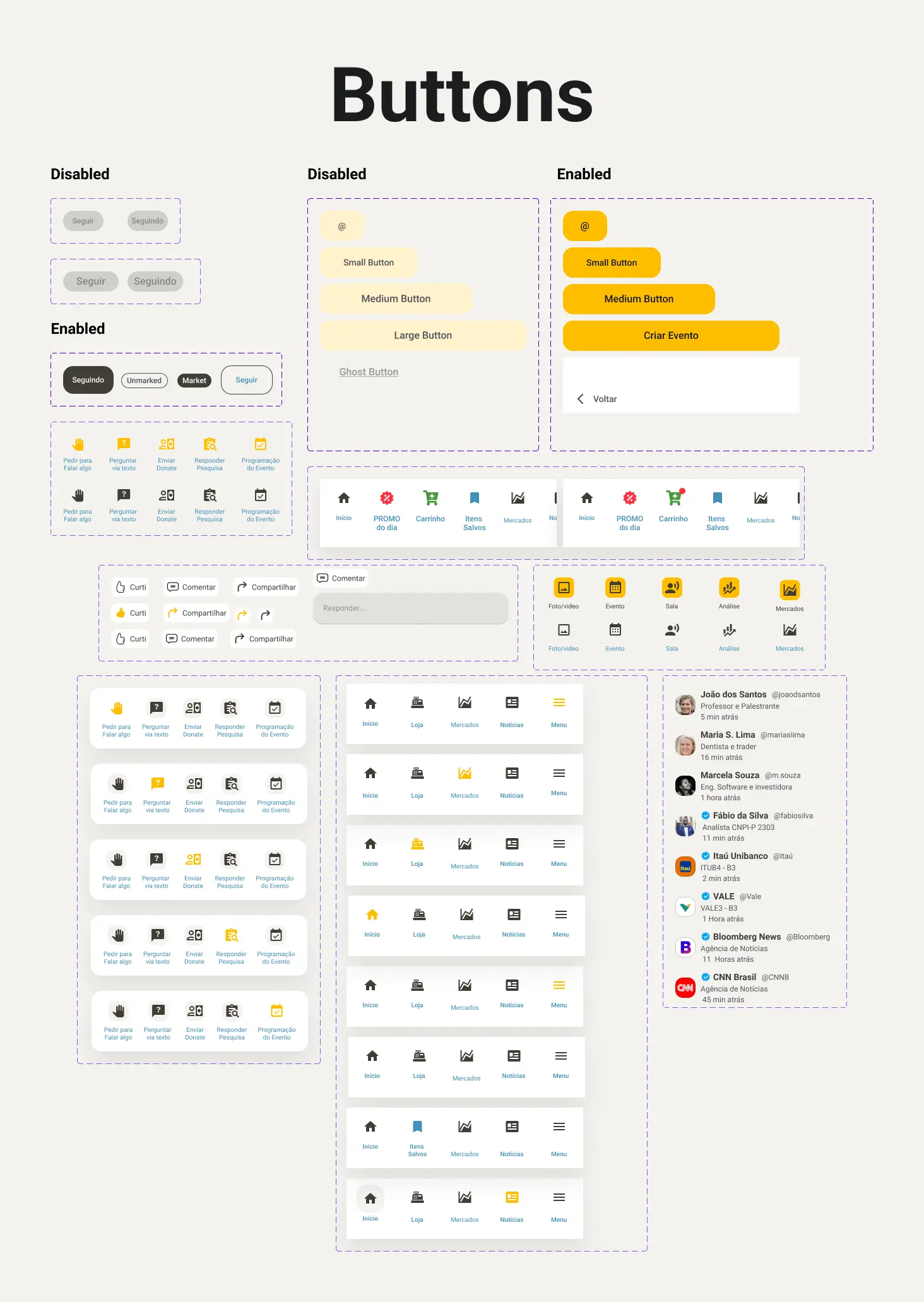
*Screenshot from Figma original file (at the end of this case study)

*Screenshot from Figma original file (at the end of this case study)
*Screenshot from Figma original file (at the end of this case study)
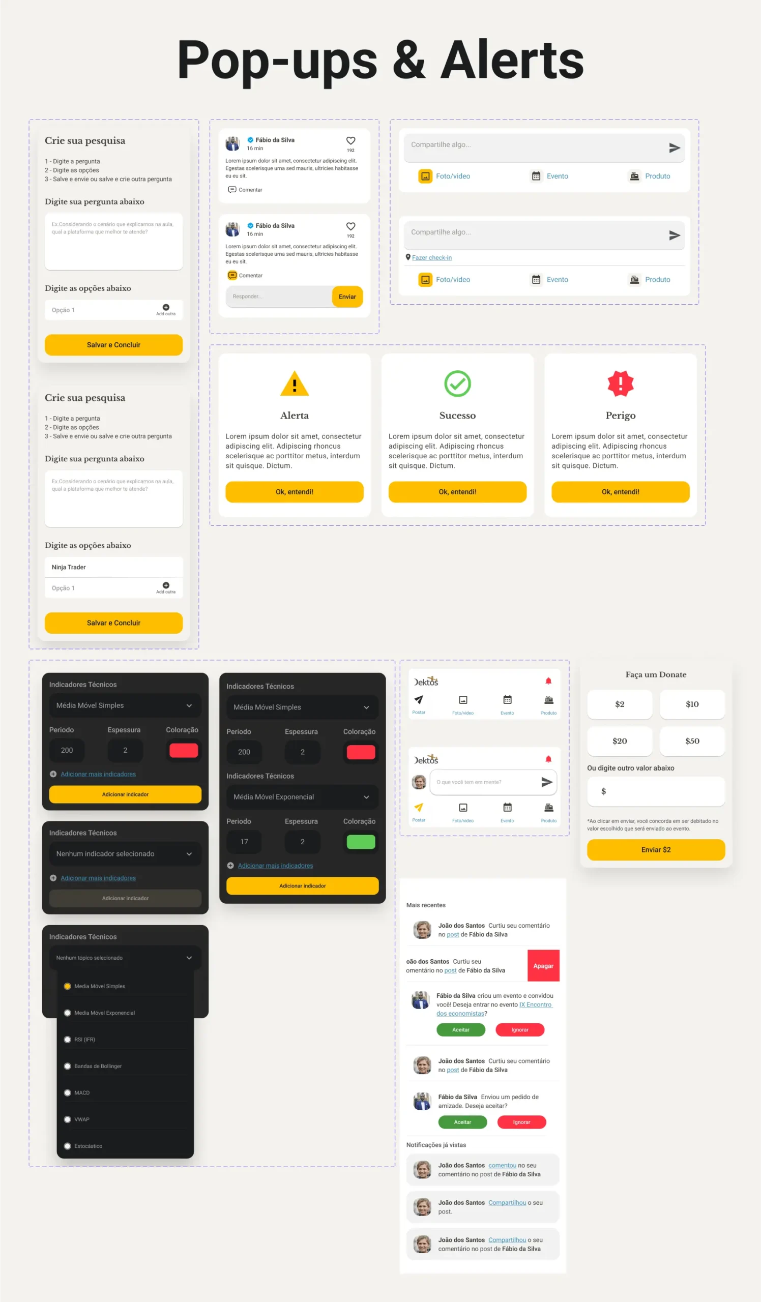
*Screenshot from Figma original file (at the end of this case study)
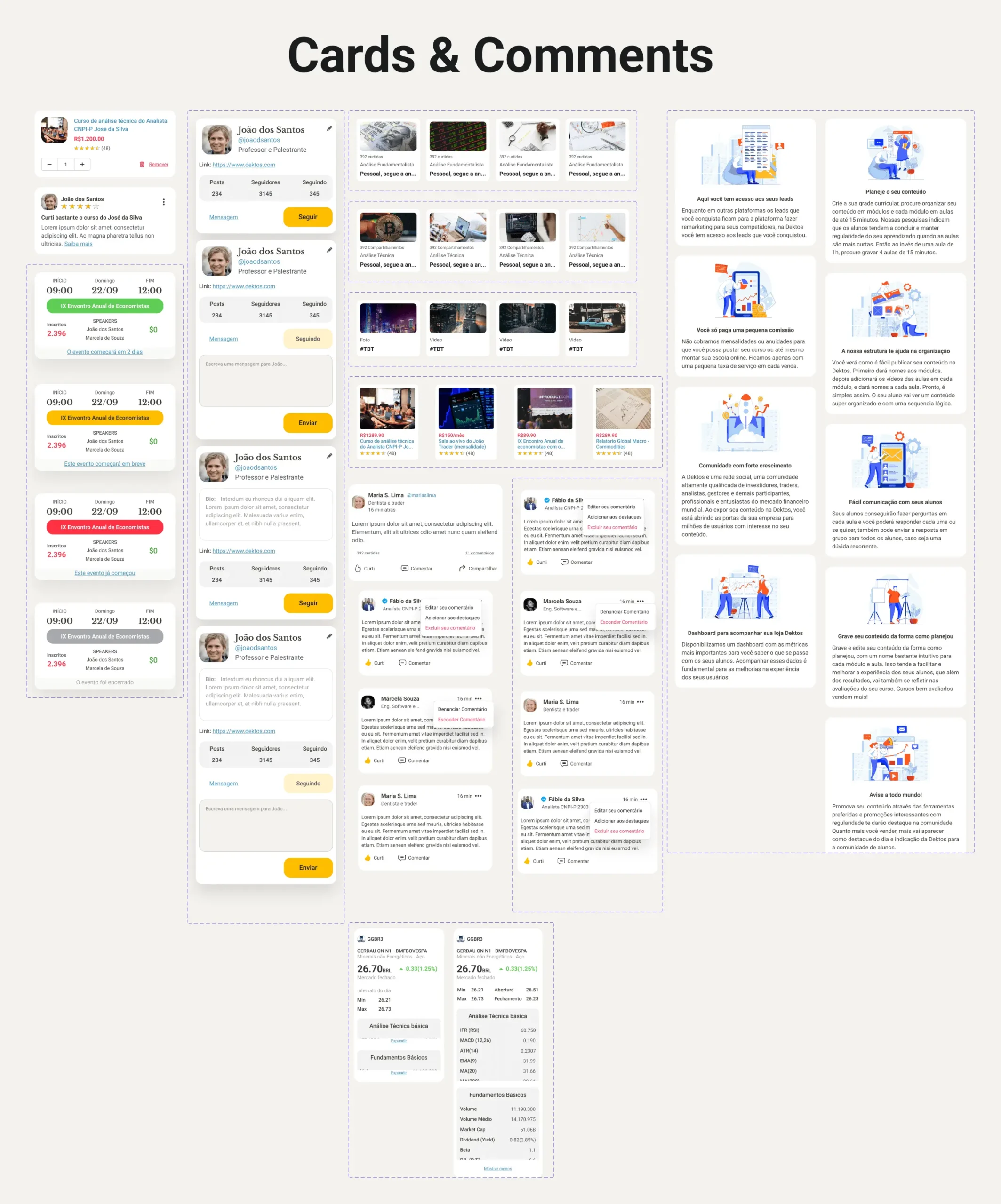
*Screenshot from Figma original file (at the end of this case study)
The prototype
You can test the prototype and see the Figma file with the design organized by features, mobile and web versions.